NOTE: For English text scroll down.
Već dvadeset jednu godinu za redom ’’Pantone institut’’ na osnovu istraživanja tržišta vrši odabir i selekciju boje godine. Na odabir utiču svetski trendovi iz apsolutno svih industrija, od modne, preko industrije nameštaja, auto industrije itd.
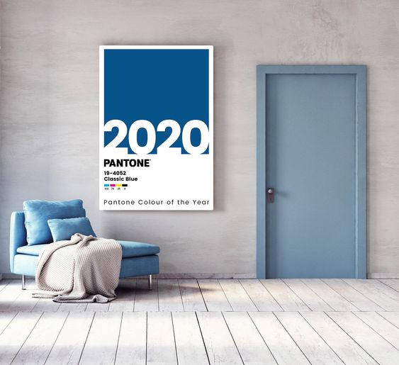
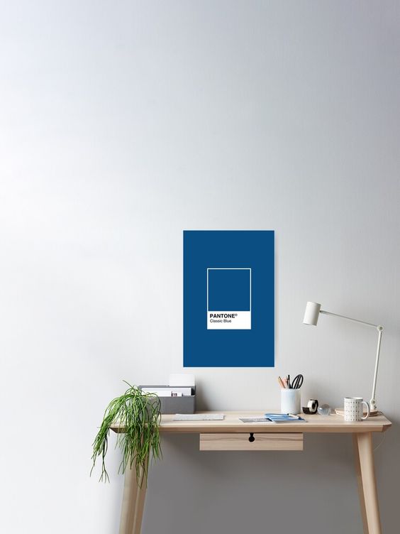
Pobednik za 2020. godinu sa punim pravom nosi boja ’’Classic blue 19-4052’’ (ova šifra se odnosi na Pantone ton kartu) .
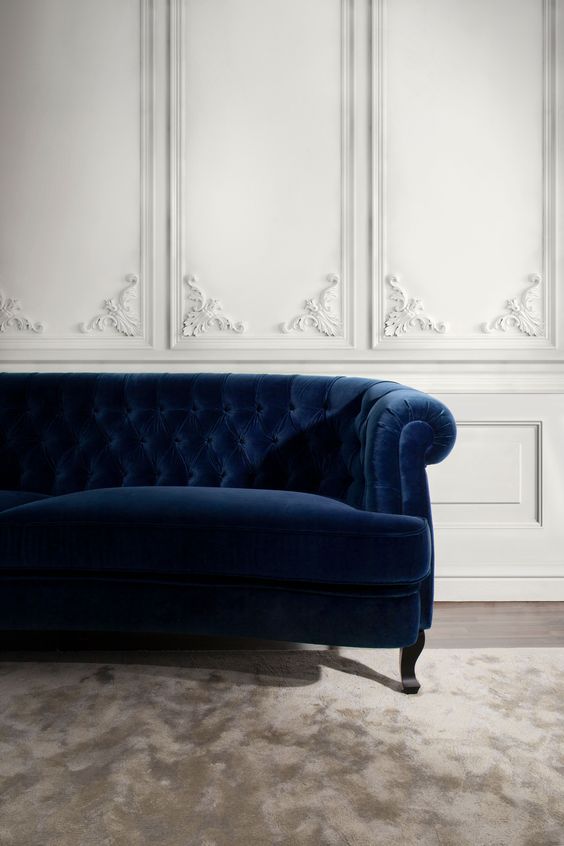
Po mom mišljenju boja nosi u sebi prefinjenost, eleganciju, određenu dubinu i toplinu. Otmena je i primenjiva je u gotovo svim industijama, što potvrđuje koliko je odabir boje precizan i smislen.
Pošto na ovom blogu pričam o enterijeru tu bih se zadržala.
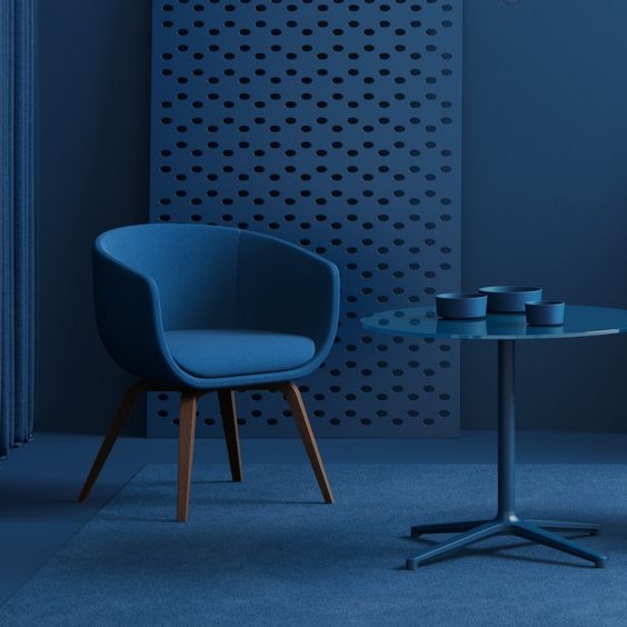
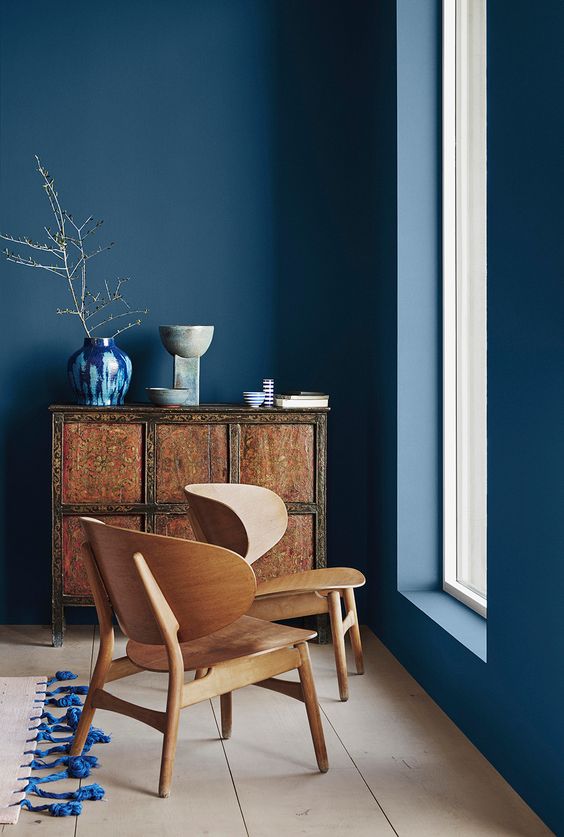
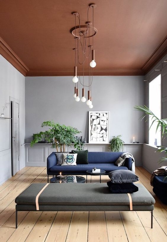
Obzirom na to da je ova nijansa veoma smela i jaka smatram da je najbolje da se proteže u prostoru samo kao detalj.
Ukoliko je prostor manjih dimenzija bilo bi idealno da se jedan sedeći deo nameštaja tapacira u mebl ove nijanse, ili kao detalj u obliku slike ili akcesoara ( vaze, servisi za ručavanje, činije,…. ). Ako je mali prostor dovoljno osvetljen mogli bi se poigrati eventualno sa jednim zidom u prostoriji. Ne bi bilo dobro da čitava prostorija bude u ovoj nijansi. Koliko god da je lepa i opuštajuća, mislim da bi u nedvoljno osvetljenom prostoru mogla početi da zatvara prostor i da ga načini još manjim.
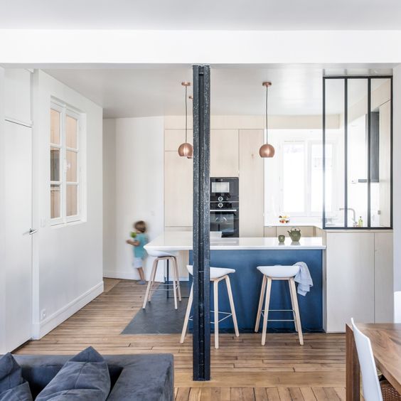
Kod velikih prostora imate odrešene ruke. Možete se odvažiti i koristiti više ove boje u oplemenjivanju vašeg prostora.
Ono što je odlično kod ove boje jeste činjenica da se može pojaviti u gotovo svim stilskim pravcima enterijera. Može se kombinovati sa dosta boja i materijala, od žute, sive, crvene, ljubičaste,…..
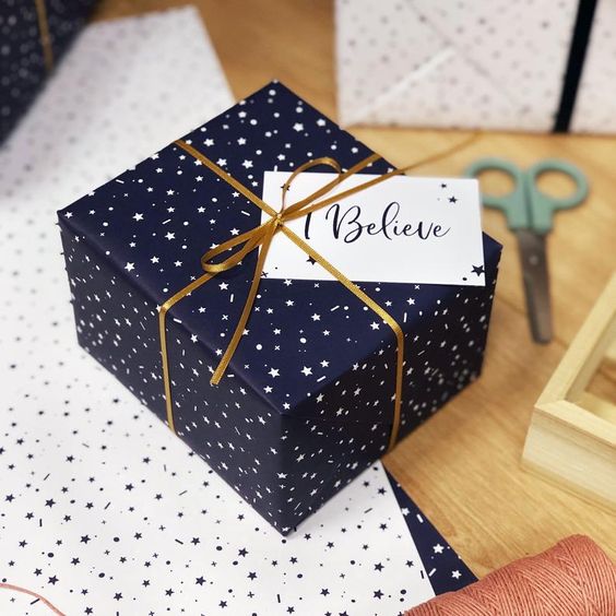
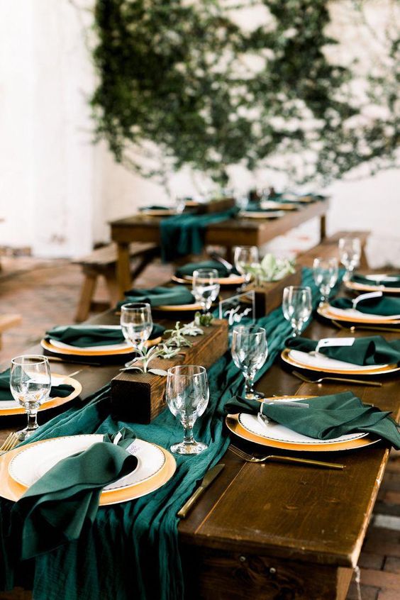
Kod stilskih prostora ukoliko kombinujete ovu nijansu sa zlatnim ili bakarnim detaljima dobijate otmenu kombinaciju koja će uvek oduzimati dah.
Drvo mirnije teksture sa više sive nijanse u sebi može biti dobitna kombinacija za prostore koji su u minimalističkom ili svedenom duhu. Najbolje je kombinovati sa hrastom, jasenom, tikovinom ili orahom.
Ako se opredelite da ubacite “Pantone Classic Blue“ u svoj enterijer najvažnije je da dobro sagledate prostor i da vidite koja je opcija optimalna za vas. Boja je jaka i dominantna stoga treba da postoji dodatni oprez jer se lako može prenaglasiti ili možete opteretiti prostor što nije poželjno.
Ukoliko vam je potrebna stručna pomoć da uredite svoj dom, možete zakazati konsultaciju sa dizajnerom enterijera preko kontakt forme ili pišite na email: vanja.lebovic@gmail.com .
Izvor fotografija Pinterest.
THE COLOR OF THE YEAR 2020, PANTONE “CLASSIC BLUE 19-4052“
For the past twenty-one years, the ‘Pantone Institute’ has been selecting the color of the year based on market research. The selection is influenced by world trends from absolutely all industries, from fashion, through the furniture industry, the auto industry, etc.
The winner of the year 2020 is rightfully bearing the color ‘Classic blue 19-4052’ (this code refers to the Pantone tone map).
In my opinion, color carries a refinement, elegance, a certain depth and warmth. It is refined and applicable in almost all industries, confirming how accurate and meaningful the color selection is.
Since I talk about interior design on this blog, that’s where I would stay.
Considering that this shade is very bold and strong, I find it best to stretch in space as a detail only.
If the space is smaller, it would be ideal for a sitting piece of furniture to be upholstered in a furniture of this shade, or as a detail in the form of a picture or accessory (vases, dining services, bowls …).
If the space is small enough we could play with one wall in the room. It would not be good for the whole room to be in this shade. As beautiful and relaxing as it is, I think in a space that is not illuminated enough, it could visually close the room and make it even smaller.
In large spaces, there are much more options. You can be more creative and use more of this color to enhance your space. What is great about this color is the fact that it can appear in almost any style of interior design. It can be combined with many colors and materials, from yellow, gray, red, purple,…
For stylish spaces, if you combine this shade with gold or copper details, you get a stylish combination that will always be breathtaking.
A wood of a softer texture with more gray hue in itself can be a winning combination for spaces that are minimalistic or reduced in spirit. It is best combined with oak, ash, teak or walnut.
If you decide to incorporate “Pantone Classic Blue” into your interior, the most important thing is to look closely at the space and see which option is optimal for you. The color is strong and dominant so there should be extra caution as it can be easily overstated or you can load the space which is not desirable.
If you need professional help to arrange your home, you can schedule a consultation with the interior designer via the contact form or write to: vanja.lebovic@gmail.com
Photo source Pinterest